Some postcards are bizarre. There is no point in altering them. They are perfect:
This card preceded the Mary Poppins movie by approximately 60 years. I call him Marty Poppins. I considered stamping springs under his shoes or adding fireworks, but why? The publisher said it all.
At the time this card was mailed, it was illegal to write anything on the blank side except for the name and address of the recipient. People did it anyway, so the law was changed. Jack, the man who mailed Marty, was a law-abiding citizen.
Other cards cry out for alterations…except for this next one, because whoever mailed it, all those decades ago, added a message that will live forever:
I bought each card because I loved them as they are, not because I thought I could improve them. I can’t improve them.
“There isn’t enough televised chess,” David Letterman said back in the 1990s the night he had a young Garry Kasparov on his show. Everybody laughed, but this is the NBA now. Times have changed.
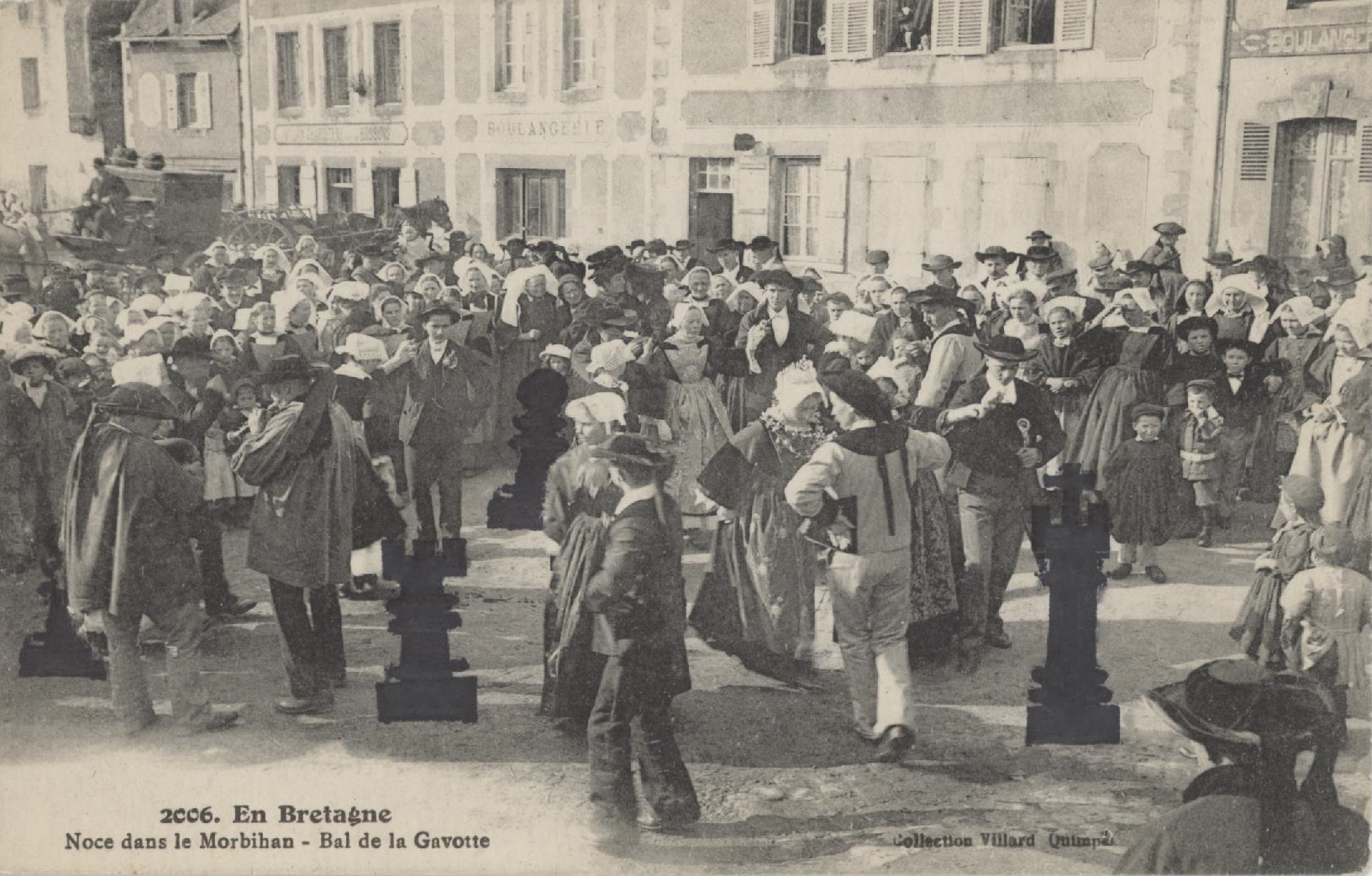
You might think it’s difficult to integrate rubber-stamped chess pieces with the images on old postcards. Think again. It’s easy.
This card is from the early 1900s and shows hundreds of costumed Normans doing the Safety Dance at a wedding in Morbihan. This is a crazy way to dress for a wedding, but it works well with the antiquated design of the chessmen. Everyone is looking in every direction so naturally some of these folks appear to be looking at the pawn, rook, and king.
If Carly Simon’s “You’re So Vain” has popped unbidden into your head, it’s because she rhymed “apricot” with “gavotte.” Yes, I think that’s crazy, too.
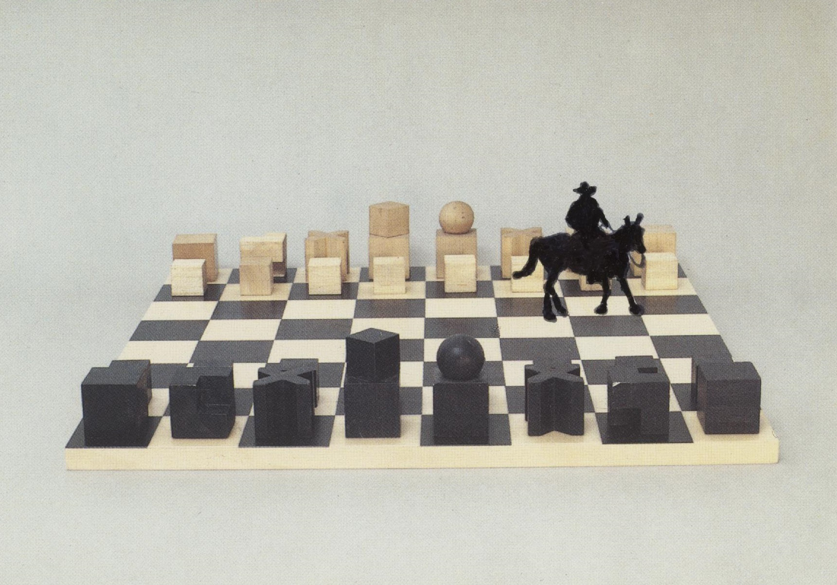
Bauhaus (the German art movement, not the British band) influenced the chess set depicted on this modern postcard. I dressed it up with my friend the cowpoke.
Bauhaus the band has a 28,800-word Wikipedia entry with 282 footnotes, which I believe exceeds the entries for the Seven Years War, the Great Wall of China, and David Letterman.
Like everyone who drives a car fueled by gasoline, I just topped off my tank and paid more per gallon than I have ever paid in my life.
Will the price I just paid look like a bargain by the end of the summer?
By the end of the summer, will the government force us to pay for gas using crypto?
I miss life when crypto was a dog.
We could all use some inspiration right now. To help myself and other writers, I’ve gone looking for words of encouragement from people who aren’t writers. Borrow from the best!
First up is the mistress of mail art, Melissa Hughes, who works with rubber stamps:
People often tell me they are waiting for inspiration or worse waiting for a “good idea,” as opposed to just an idea that maybe could be made good if it was allowed to be born, but we try to edit in the thinking stage and all that does is shut one down. I used to wait for inspiration, but that is kind of like waiting until it rains to get water to drink.
Don Carr, who died in 1993 and left us with his dreams, was a master of rubber stamps and colored pencils. Don was not afraid of showing up at his desk, grabbing his tools, and going for it. Go in the wrong direction? So what? “The mistake is sometimes more interesting than the intended impression,” he once said.
Babe Ruth would’ve known what Don meant. The Babe believed that every swing and a miss brought him closer to his next homerun.
The fear of error
This brings us to the late Chuck Yungkurth, an engineer by trade and a lover of trains, who wrote an essay with that title for Model Railroader in January 1978. Yungkurth had noticed something he couldn’t understand at his model train club: Armchair modelers. These men claimed they were enjoying the hobby in their own way:
I am skeptical. The stacks of kits and equipment are bound to be depressing. The number of times these would-be modelers turn up disposing everything at the annual auctions in our club leads me to believe that is the ultimate end for these people. The solution is to plan and theorize to a point—and then start construction.
But what if you screw up? Guess what, you will screw up. Babe Ruth knew that strikes are just part of the game. “Model railroading is a hands-on, learn-by-doing business,” Yungkurth wrote. “All really fine modelers can tell horror stories of early blunders…yet all consider these part of the learning process.”
I have to include one writer in this post, so I’m cuing up Garrison Keillor. According to our man Yungkurth, “there are almost no errors or mistakes that cannot be rectified, nor are there any real penalties for failure.” Keillor agrees: “Be bold, thrust forward, and have the courage to fail. After all, it’s only writing. Nobody is going to die for our mistakes or even lose their teeth.”
“Do something—do anything—and don’t be afraid of making mistakes,” Yungkurth wrote. Stop waiting for inspiration, my friend Melissa says. Mistakes might be interesting, and they’ll certainly teach you something, Don Carr knew.
The only secret: Show up at your desk.
Fifteen minutes a day.
Two hours a day, two days a week.
Early every morning or late every night.
“Daily writing and one day off”: One of my teachers, Merridawn Duckler.
There’s a schedule that will work for you. You’ll know it when you find it.
Chuck Yungkurth: “Better small than not at all.” This is Tango’s interpretation of me revising my novel. I type; she chews.
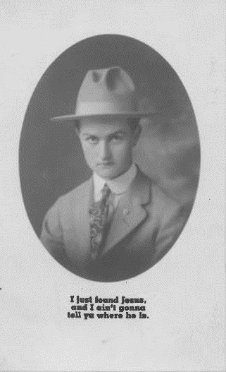
Donald Trump is confused. First he thought he was Jesus. Then he thought that Jesus was a doctor. And then he thought that he and Jesus could heal the sick by taking their money so they couldn’t pay for a doctor.
Trump is not too clear on his job description. He doesn’t know much about other jobs, either. He said that Pope Leo is “weak on crime.” Trump doesn’t understand that the Pope can’t arrest people. His Holiness can’t even bust wayward altar boys.
In honor of Donald Trump’s love affair with the Son of God, here’s a postcard from my collection. This card was published before World War I, in the era when you dressed up and visited a photography studio and they turned your photo into postcards. There’s no note on the card to reveal the identity of the man in the hat. If there’s a heaven, I hope this gentleman will forgive me for the caption I gave him.
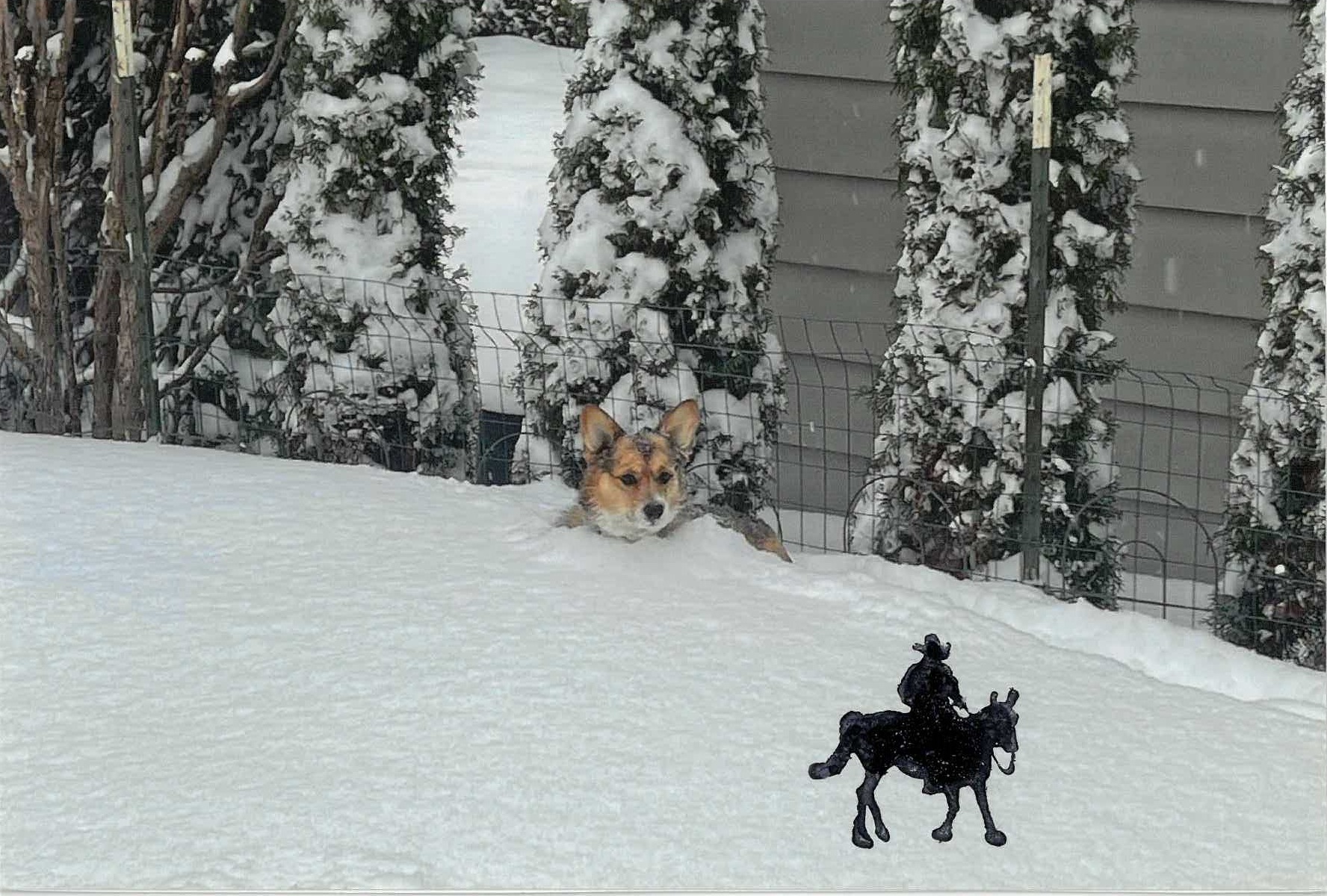
The atmosphere of Earth 1 is growing warmer. There may be fewer backyards full of snow in our future. We had almost no snow in our backyard this winter. So here’s a photo of the snows of yesteryear, otherwise known as 2023.
Tango the moment before she exploded into action. Our property was invaded by a lone Nazgûl, one of Sauron’s Black Riders. Bing Crosby sang a song about him back in 1936:
I’m an old Nazgûl, from the Rio Grande But my legs ain’t bowed and my cheeks ain’t tan I’m a cowboy who never saw a cow Never roped a steer cause I don’t know how Sure ain’t a fixin to start in now Yippie yi yo kay-ay
“Yippie yi yo kay-ay” is, of course, from one of the Elven languages. I’m not sure of its meaning. Some filler stuff about a Ring.
This goes-anywhere stamp was published by Art Impressions of Salem, Oregon, year unknown. If you go looking for it, the stock number is F-3270.
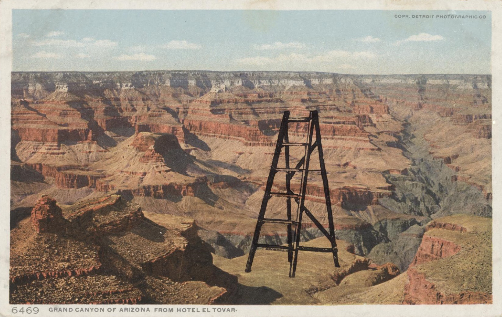
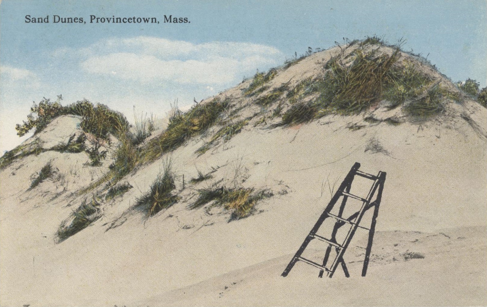
This stamp of an old-fashioned wooden ladder was made by Stamp Francisco. (The owner retired last year and closed her doors.) There’s something about this image that goes almost everywhere.
You can pose people on it or diving or flying off it. You don’t have to restrict yourself to lonely vistas, either.
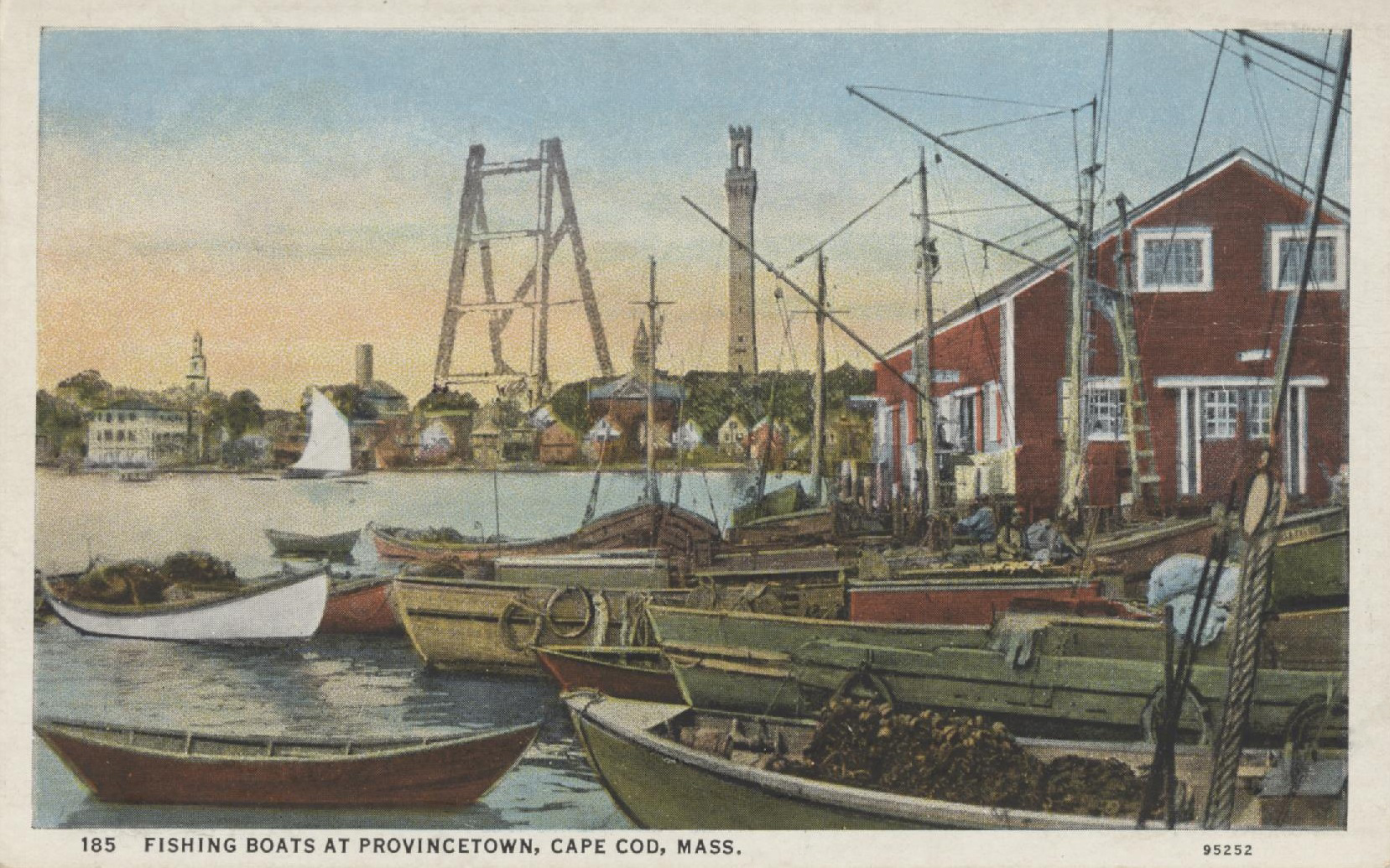
I have climbed that tower. You can’t visit the Cape and not climb it. Too bad they don’t have a ladder, too.
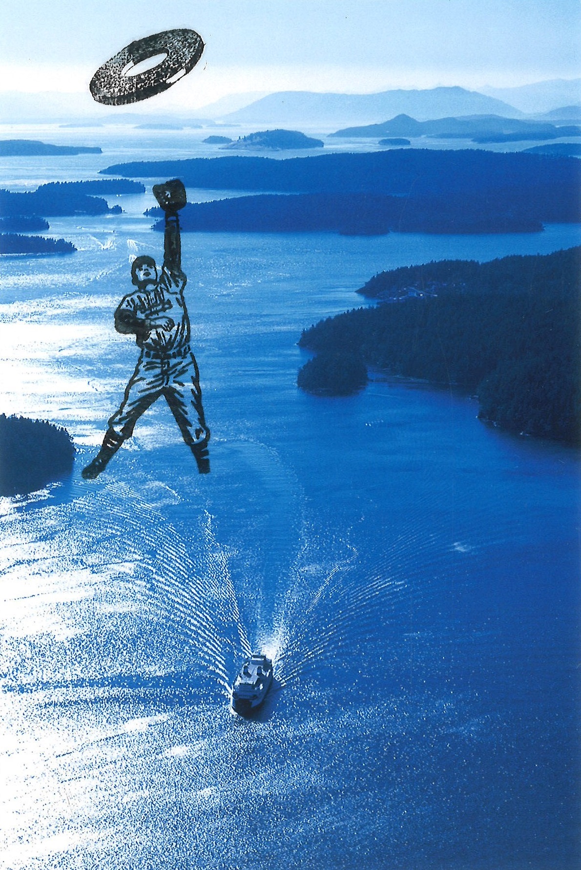
If you decide to make a career out of defacing postcards, you don’t have to confine yourself to antique cards with a paper finish. You can always stamp modern postcards, which have a shiny, slick surface. Collectors call these cards “chromes,” short for Kodachrome.
Caption on the back: “A Washington state ferry navigates Harney Channel in the San Juan Islands.”
The ink on a modern postcard (or a photograph) will never completely dry, though you should be able to color it with markers after a few weeks.
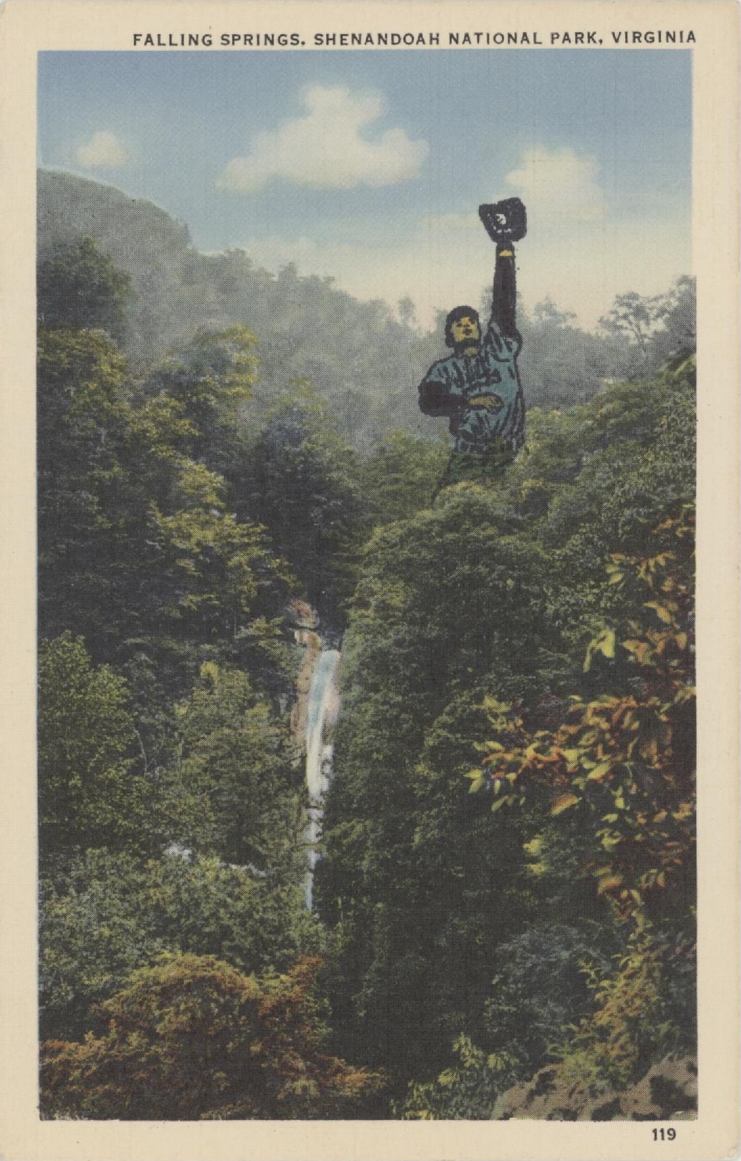
This baseball player is a particularly useful little guy. Here he is on a card from the 1920s:
He’s also good for standing upside down, dancing like no one is watching, holding onto objects while being blown sideways, and chasing through space.
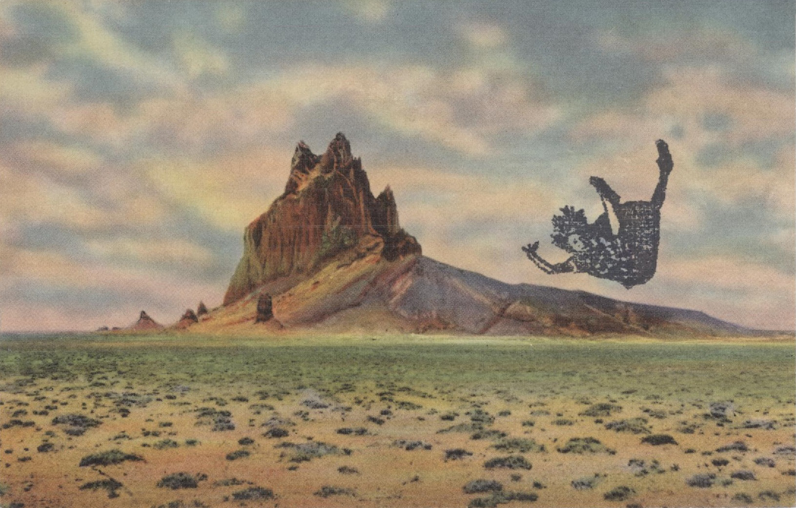
Sometimes I can’t think of what to do to a particular postcard and sometimes the rubber stamp jumps from its drawer and says “Pick me! Pick me!” These 1920s views of the U.S. Southwest are plentiful and painterly. They are fun to stamp because they usually give you a vast expanse of sky to play with.
Looks like an economics chart. This unfortunate lady is heading for the intersection of a supply and demand curve!
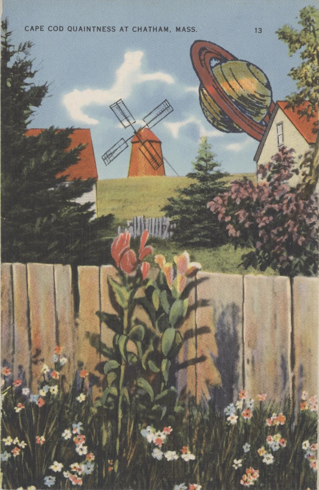
Cape Cod, Massachusetts, was always quaint in these linen postcards of the 1920s and 30s. When the word quaint entered English in the 12th century, it meant clever. We use it to mean old-fashioned. Cape Cod a hundred years ago was considered the headquarters of everything old and out-of-date: windmills, Colonial houses, crusty Yankees, lonely beaches, every Model T left in America, and simple fisher folk playing checkers. These cards go for pennies. As you can see, they take ink wonderfully well.
My stamp of Saturn (manufacturer unknown) was mounted on a square of hard transparent plastic. That makes it a cinch to position the image. I don’t remember what I paid for it, but if I paid something extra, it was worth it.
Rubber-wise tip of the week: The only stamp pads you need are the primary colors: red, yellow, and blue. Minus the yellow. Ink from your other pads will muddy the yellow quicker than you can say “On Olde Cape Cod.” Substitute black.
As for the secondary colors, orange might work. Purple is close to red and can look pink. A forest green is good; a pale green gets lost.
White, silver, gray, and gimmicky “rainbow” pads are likewise out. All the way out. The rainbow pads will look like a blur soon enough, you’ll never use white and silver unless you only stamp on black paper, and gray, once it’s stamped, looks as if you were too cheap to buy a new stamp pad.
Masking is how you block part of a rubber stamp’s image. The simplest way to achieve this is to place a thin sheet of paper (the mask) on the work surface, then stamp partway on, partway off the mask. Tracing paper works best, but pages from The New Yorker also work well. Your biggest challenge is alignment.
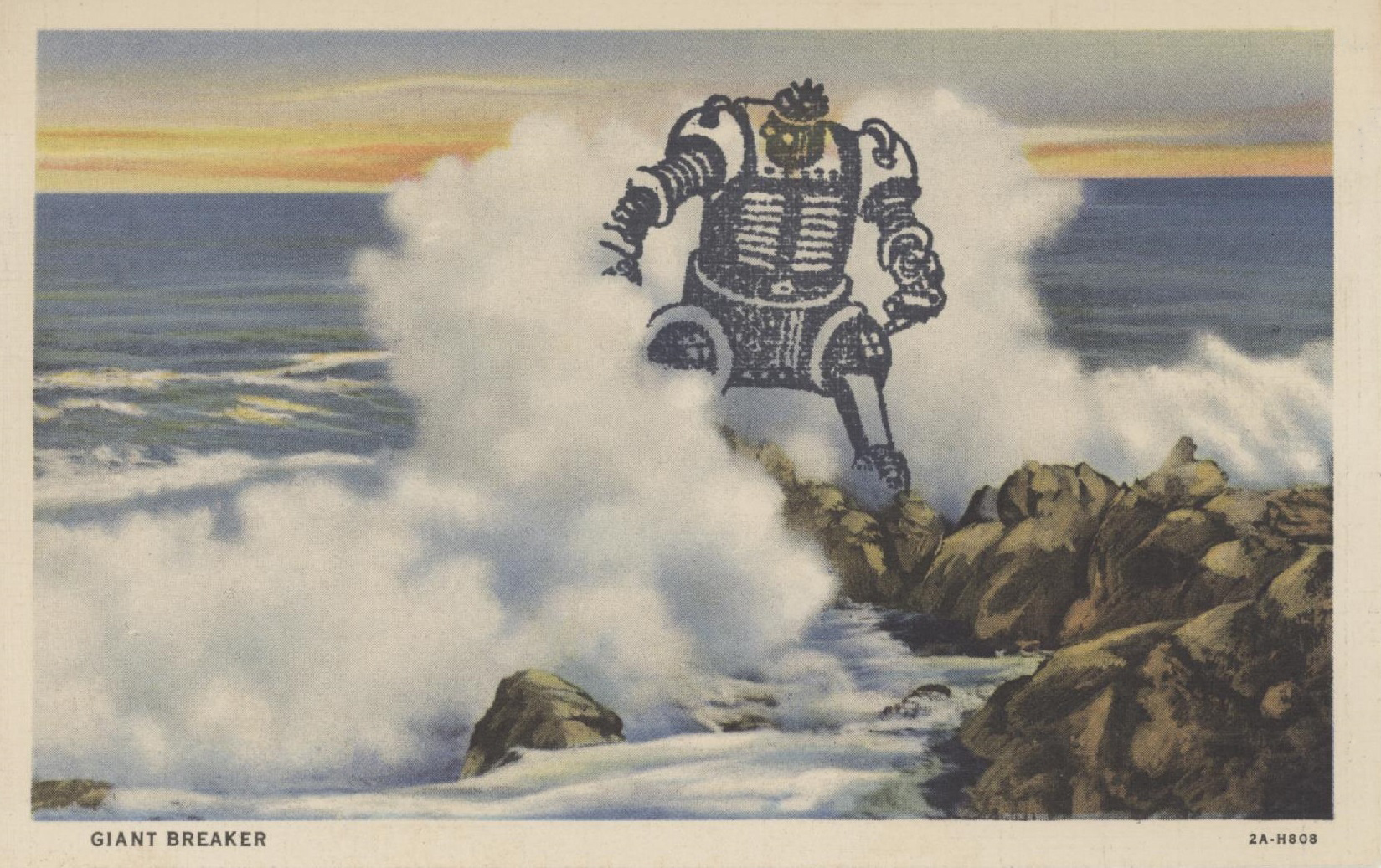
There are other ways to mask an image. You can stamp it onto a Post-it, then cut the image out of the paper. For the Giant Breaker Robot below, I used tracing paper to trace the breaking wave and the rocks and cut out the outline. I positioned the outline on the postcard, then stamped the robot. Most of his legs and one hand (appendage?) stamped harmlessly onto the tracing paper.
Mr. Robot (if he were a she, she wouldn’t be caught dead with hair like that) was made by Namz Rubber Stamp Co. He is one of my most useful stamps. He takes colors well, even if you just want to dot his eyes with red. But after I saw how he looked in the breaker, I left him alone.
This postcard of a generic surfside scene was published in the 1920s or 30s. Collectors call this type of card a linen, as it’s cardboard but with a textured finish. Linens are the most desirable cards for defacing. They take stamp-pad ink, colored pencils, and markers well, and they usually have vibrant colors because they started out as black and white photos that were then hand-painted. Linens are cheap. That’s good, because you’ll ruin plenty of them.
Footnote: If you’re not happy with a particular stamp, consider altering it. I had a stamp of a hair dryer trailing wild loops of wire. The hair dryer could’ve been any hair dryer, but the wire looked evil. I finally carved the hair dryer off with an X-Acto knife. Then I had a high-tech snake. Perfect.