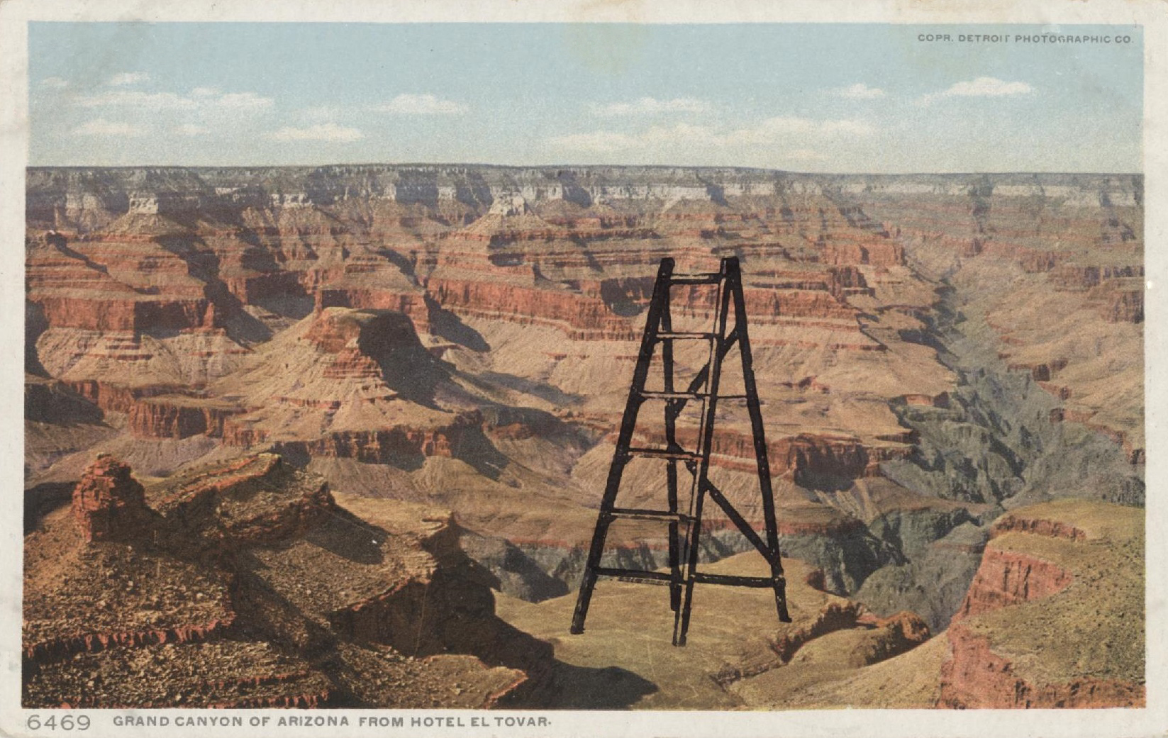
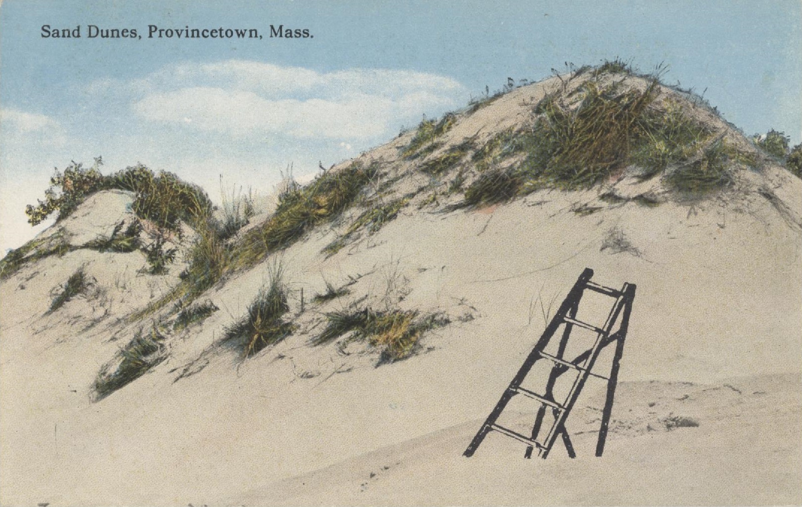
This stamp of an old-fashioned wooden ladder was made by Stamp Francisco. (The owner retired last year and closed her doors.) There’s something about this image that goes almost everywhere.
You can pose people on it or diving or flying off it. You don’t have to restrict yourself to lonely vistas, either.
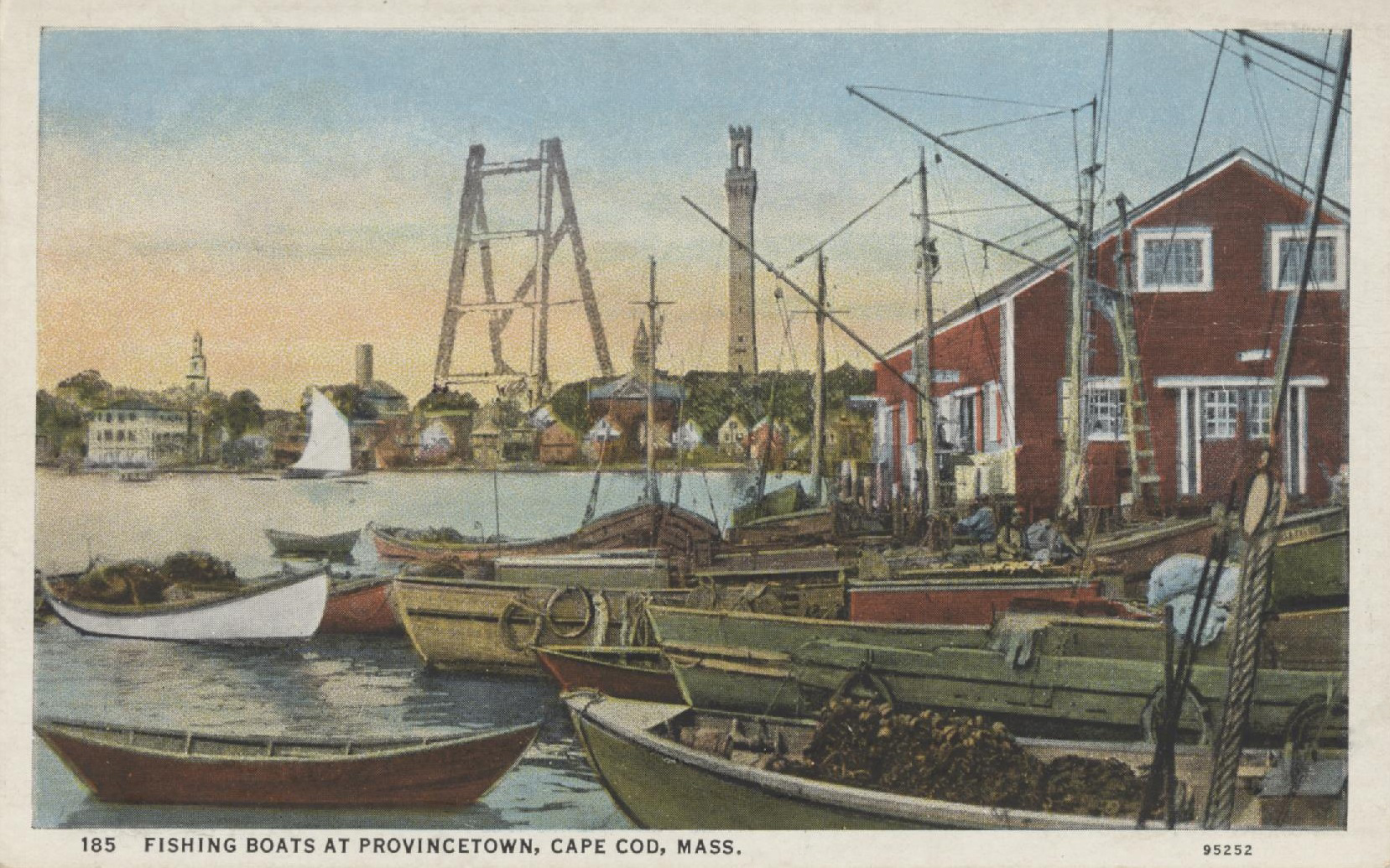
I have climbed that tower. You can’t visit the Cape and not climb it. Too bad they don’t have a ladder, too.
If you decide to make a career out of defacing postcards, you don’t have to confine yourself to antique cards with a paper finish. You can always stamp modern postcards, which have a shiny, slick surface. Collectors call these cards “chromes,” short for Kodachrome.
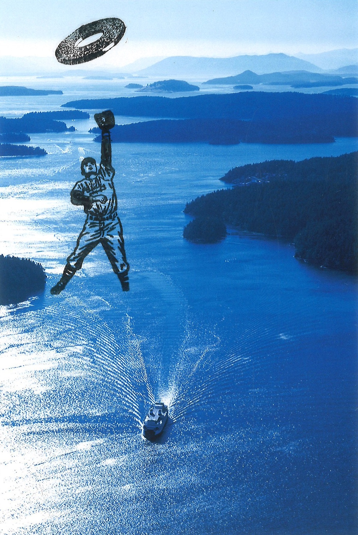
Caption on the back: “A Washington state ferry navigates Harney Channel in the San Juan Islands.”
The ink on a modern postcard (or a photograph) will never completely dry, though you should be able to color it with markers after a few weeks.
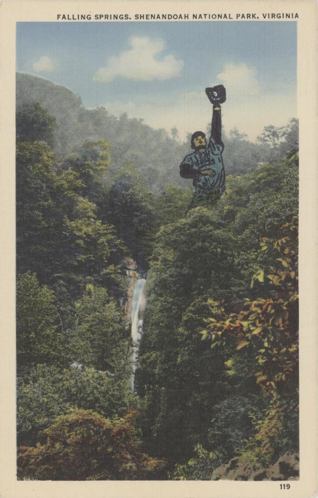
This baseball player is a particularly useful little guy. Here he is on a card from the 1920s:
He’s also good for standing upside down, dancing like no one is watching, holding onto objects while being blown sideways, and chasing through space.
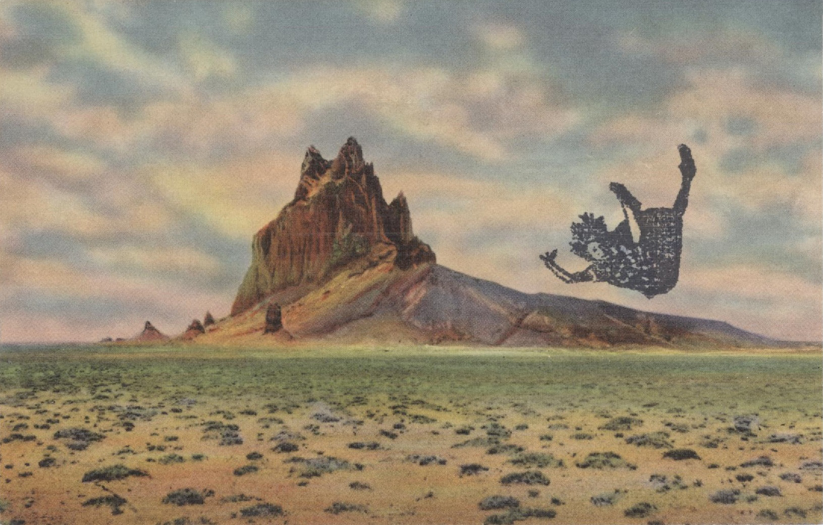
Sometimes I can’t think of what to do to a particular postcard and sometimes the rubber stamp jumps from its drawer and says “Pick me! Pick me!” These 1920s views of the U.S. Southwest are plentiful and painterly. They are fun to stamp because they usually give you a vast expanse of sky to play with.
Looks like an economics chart. This unfortunate lady is heading for the intersection of a supply and demand curve!
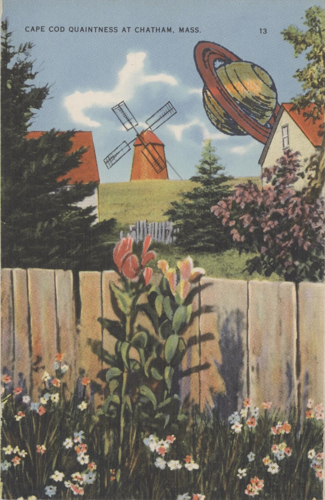
Cape Cod, Massachusetts, was always quaint in these linen postcards of the 1920s and 30s. When the word quaint entered English in the 12th century, it meant clever. We use it to mean old-fashioned. Cape Cod a hundred years ago was considered the headquarters of everything old and out-of-date: windmills, Colonial houses, crusty Yankees, lonely beaches, every Model T left in America, and simple fisher folk playing checkers. These cards go for pennies. As you can see, they take ink wonderfully well.
My stamp of Saturn (manufacturer unknown) was mounted on a square of hard transparent plastic. That makes it a cinch to position the image. I don’t remember what I paid for it, but if I paid something extra, it was worth it.
Rubber-wise tip of the week: The only stamp pads you need are the primary colors: red, yellow, and blue. Minus the yellow. Ink from your other pads will muddy the yellow quicker than you can say “On Olde Cape Cod.” Substitute black.
As for the secondary colors, orange might work. Purple is close to red and can look pink. A forest green is good; a pale green gets lost.
White, silver, gray, and gimmicky “rainbow” pads are likewise out. All the way out. The rainbow pads will look like a blur soon enough, you’ll never use white and silver unless you only stamp on black paper, and gray, once it’s stamped, looks as if you were too cheap to buy a new stamp pad.
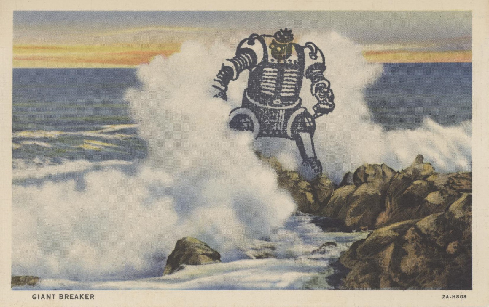
Masking is how you block part of a rubber stamp’s image. The simplest way to achieve this is to place a thin sheet of paper (the mask) on the work surface, then stamp partway on, partway off the mask. Tracing paper works best, but pages from The New Yorker also work well. Your biggest challenge is alignment.
There are other ways to mask an image. You can stamp it onto a Post-it, then cut the image out of the paper. For the Giant Breaker Robot below, I used tracing paper to trace the breaking wave and the rocks and cut out the outline. I positioned the outline on the postcard, then stamped the robot. Most of his legs and one hand (appendage?) stamped harmlessly onto the tracing paper.
Mr. Robot (if he were a she, she wouldn’t be caught dead with hair like that) was made by Namz Rubber Stamp Co. He is one of my most useful stamps. He takes colors well, even if you just want to dot his eyes with red. But after I saw how he looked in the breaker, I left him alone.
This postcard of a generic surfside scene was published in the 1920s or 30s. Collectors call this type of card a linen, as it’s cardboard but with a textured finish. Linens are the most desirable cards for defacing. They take stamp-pad ink, colored pencils, and markers well, and they usually have vibrant colors because they started out as black and white photos that were then hand-painted. Linens are cheap. That’s good, because you’ll ruin plenty of them.
Footnote: If you’re not happy with a particular stamp, consider altering it. I had a stamp of a hair dryer trailing wild loops of wire. The hair dryer could’ve been any hair dryer, but the wire looked evil. I finally carved the hair dryer off with an X-Acto knife. Then I had a high-tech snake. Perfect.
I admit that it’s Tuesday and not Monday. Why didn’t I post my next postcard yesterday? “I hate Mondays.”
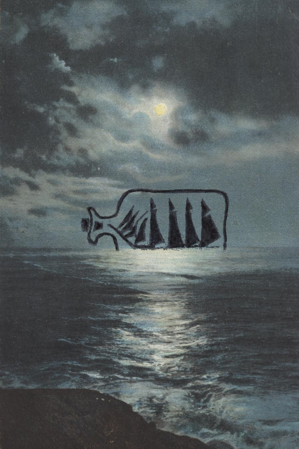
This week I continue my seafaring theme with a very useful stamp produced in 1993 by A Stamp in the Hand Company. In the tradition of most rubber-stamp companies, they seem to have disappeared.
What makes this stamp useful is that it’s mostly an image of a glass bottle. If you stamp it over a postcard, the features behind it will show through…exactly as if you were looking through a real glass bottle. It looks real, or as real as a giant glass bottle on the horizon can look.
It also helps that the sails are black, as if seen in shadow.
This card is a black and white image that was hand-tinted in Germany before World War I.
Happy belated Monday, everyone. Stay safe out there.
Jeff Goins wrote Real Artists Don’t Starve. I’m not recommending this book. But Goins does emphasize that you should never create for free. I haven’t always kept to that plan–there was one story I desperately wanted to publish, and no paying market would touch it–but I’ve tried.
Goins relates an interesting statistic. The majority of people who take unpaid internships never get offered a full-time job. The majority of people who take PAID internships do get offered a job. So when someone offers you exposure instead of cash, ask yourself how much coffee you can buy with exposure.
Goins, in describing artists we can all emulate, for instance Michelangelo, notes that they didn’t confine themselves to one art form. So every Monday for the rest of 2026 I’ll expand my portfolio by sharing my altered postcards.
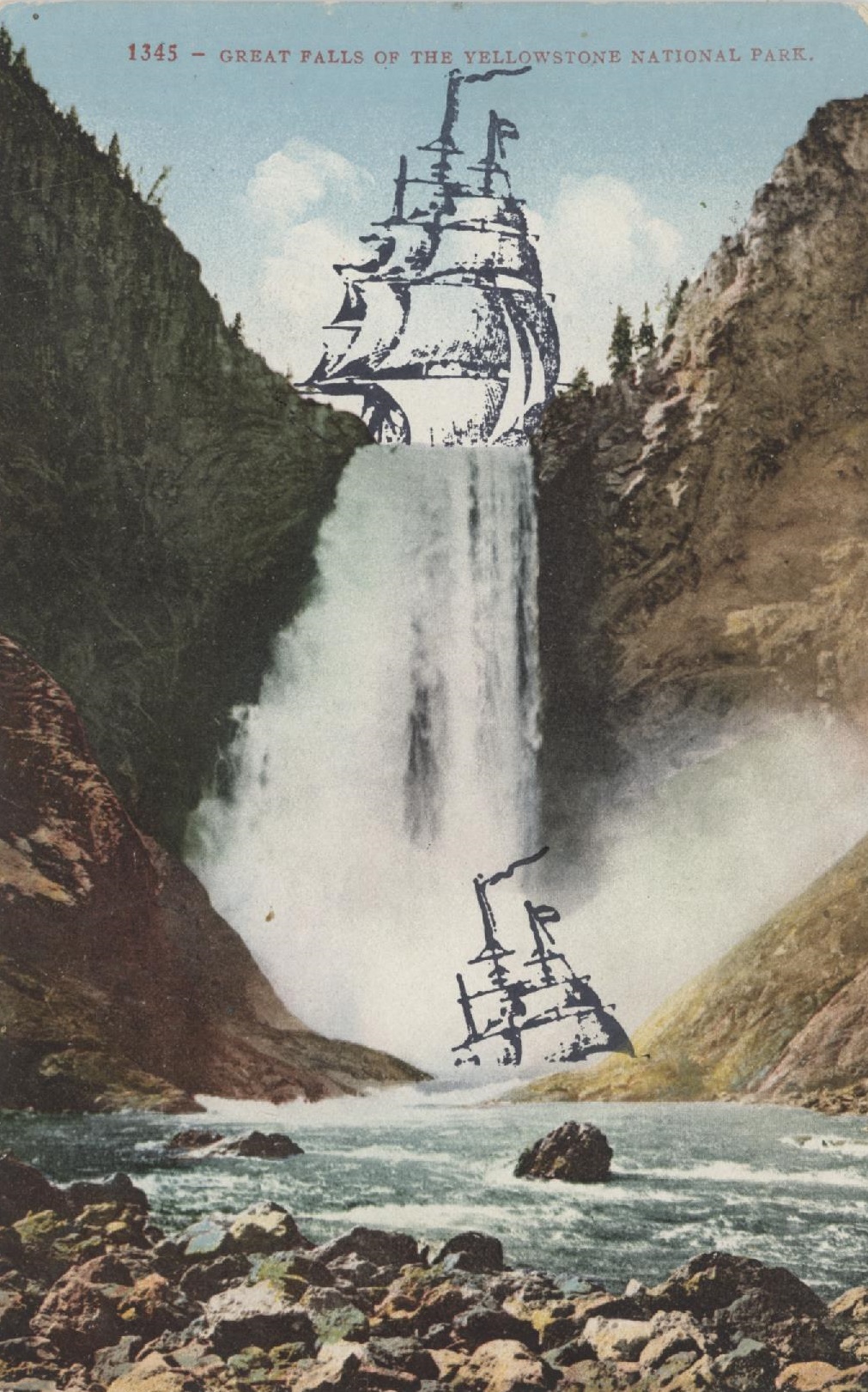
I don’t know if I invented the art form of rubber-stamping on old postcards, but I may have been the first person to write about it (Rubberstampmadness, 1993). Today’s card was published in the 1920s. I used extra thin paper to mask the ship’s hull. I only wanted the sails and rigging. Any resemblance between this image and my government’s economic policy is coincidental.