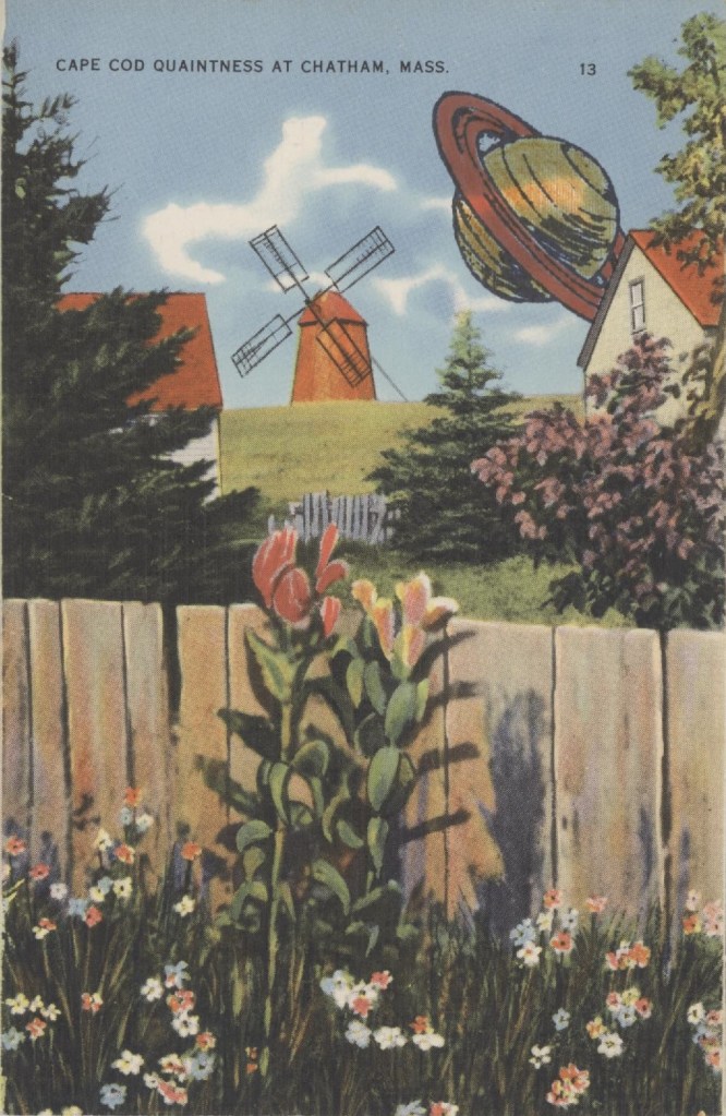
Cape Cod, Massachusetts, was always quaint in these linen postcards of the 1920s and 30s. When the word quaint entered English in the 12th century, it meant clever. We use it to mean old-fashioned. Cape Cod a hundred years ago was considered the headquarters of everything old and out-of-date: windmills, Colonial houses, crusty Yankees, lonely beaches, every Model T left in America, and simple fisher folk playing checkers. These cards go for pennies. As you can see, they take ink wonderfully well.

My stamp of Saturn (manufacturer unknown) was mounted on a square of hard transparent plastic. That makes it a cinch to position the image. I don’t remember what I paid for it, but if I paid something extra, it was worth it.
Rubber-wise tip of the week: The only stamp pads you need are the primary colors: red, yellow, and blue. Minus the yellow. Ink from your other pads will muddy the yellow quicker than you can say “On Olde Cape Cod.” Substitute black.
As for the secondary colors, orange might work. Purple is close to red and can look pink. A forest green is good; a pale green gets lost.
White, silver, gray, and gimmicky “rainbow” pads are likewise out. All the way out. The rainbow pads will look like a blur soon enough, you’ll never use white and silver unless you only stamp on black paper, and gray, once it’s stamped, looks as if you were too cheap to buy a new stamp pad.
Don’t forget to send me one!